All articles (page 4 of 9):

Terminus (TTF) v4.32 released

On in “Devstuff” by Tblue
Tags: , , ,

At the end of last year, Terminus Font 4.32 was released. On that occasion, I regenerated my TTF version, which now is officially called Terminus (TTF).

This time, I used Potrace instead of the old and unmaintained Autotrace to trace the bitmaps. As a result, the font’s outlines look a little bit more smooth than they did before; please tell me how you like them! If too many people complain about the smoothness, I will go back to Autotrace, promised. :-)

It may be that using Potrace fixes the issues some of you had — but there’s a chance that it makes things even worse… Anyway, just drop me a line if you have any problems so I can look at it. I can’t promise anything, though (except reverting to Autotrace, as I said above).

Please also note the license change: Just like Terminus Font, starting with version 4.32 (i. e. this release), Terminus (TTF) is licensed under the Open Font License, Version 1.1 — but don’t panic:

It’s FSF approved, no need to worry.

—Dimitar Zhekov, author of Terminus Font

The Arch Linux PKGBUILD and the mkttf scripts have been updated to reflect the changes made in this release.

Enough said, you can get the shiny new TTF files here: http://files.ax86.net/terminus-ttf/files/4.32/

Have fun!
Now you can easily generate your own TTF versions of the Terminus font

On in “Devstuff” by Tblue3 comments
Last updated: Sat, 12 June 2021 22:08 CEST
Tags: , , ,

More than 6 months ago, I wrote about generating TTF versions of the Terminus font (and published mine on that occasion), but I didn’t actually explain how to generate them.

I found the answer to my problem (“How do I get TTF files from the Terminus BDF source files?”) in the FontForge FAQ:

  • Create a new font.
  • Import the different sizes (one BDF file per font size). Make sure to import the BDF file with the biggest bitmaps into the glyph background!
  • Select all glyphs.
  • Autotrace them.
  • Add extrema.
  • Simplify all glyphs.
  • Save as TTF.

This process requires the AutoTrace program and FontForge, obviously. While repeating these steps at least two times (for the medium and bold versions of Terminus) is not that hard, I really like to automate things. I also wanted an italic version (I accomplished that by running the BDF files through mkitalic).

Fortunately, FontForge is scriptable! This allowed me to write a script in FontForge’s own “legacy” scripting language (the build I used didn’t support Python scripts…) to perform the steps described above, a small wrapper for AutoTrace to remove the obnoxious borders it adds to the resulting Postscript “images” and a small shell script wrapper that runs mkitalic to produce italic BDF files, tells FontForge to use my AutoTrace wrapper and finally runs the FontForge script for the three different font weights (medium, bold and italic).

Since I had to do some research to obtain the above information, I thought it would be nice to allow other people to easily generate TTF versions of Terminus (mind you, I might lose interest some day!). The scripts I wrote were only tested on unixoid systems (I didn’t test whether they correctly run on Windows, e. g. using Cygwin or CoLinux; they probably do, though).

Get the scripts here: https://github.com/Tblue/mkttf/archive/master.zip.

Also check out my Git repository on GitHub.

Read the included README file for information on how to use the mkttf.sh script. Feel free to post comments (questions, constructive criticism…)!

You might want to use these scripts to generate TTF versions of other fonts than Terminus, too; since the scripts are all fairly generic, it should be sufficient to modify mkttf.sh.

Have fun!

Chaosradio Express-RSS-Feed in Liferea richtig anzeigen

On in “Software” by Tblue
Tags: , , ,

Der Chaosradio Express-RSS-Feed wird vom RSS-Reader Liferea nicht richtig angezeigt (das dürfte natürlich auch auf andere Feeds zutreffen, die wie im Folgenden beschrieben formatiert sind).

Das liegt daran, dass der von Liferea gewünschte HTML-Inhalt jedes Elements in einem einfachen XHTML-<body>-Tag steht, das der Reader nicht zu beachten scheint. Da der RSS-Feed aber <itunes:summary>-Tags enthält, zeigt Liferea stattdessen deren Inhalte an. Das Problem? Dieses Tag enthält — jedenfalls bei diesem Feed — reinen Text und kein HTML. Man bekommt also im Reader nur eine lange, schlecht lesbare Zeile Text zu Gesicht… Dabei wäre es doch viel angenehmer, die formatierten HTML-Inhalte präsentiert zu bekommen.

Meine Lösung besteht aus einem XSLT-Stylesheet, einem XSLT-Prozessor (xsltproc aus libxslt) und Lifereas Filter-Feature.

Um das XSLT-Stylesheet mit Liferea zu nutzen, lädt man es herunter, wählt in den Feed-Eigenschaften auf dem Quelle-Tab Benutze einen Filter zum Konvertieren und trägt in dem erscheinenden Textfeld etwas ein wie:

xsltproc /pfad/zum/xslt-stylesheet -

Der Bindestrich am Ende ist nötig! Er steht für stdin, die Standardeingabe, über die Liferea den Feed an xsltproc weitergibt.

Et voilà! Der nächste CRE-Podcast sollte nun richtig formatiert angezeigt werden.

Erklärung: Das Stylesheet entfernt alle <itunes:summary>-Elemente und ersetzt die <body>-Tags durch <content:encoded>-Tags, die Liferea gerne hat.

Das obige Mini-Howto trifft auf Liferea 1.6.3, laufend auf einem Linux-System, zu.

Generating up-to-date TTF files for the Terminus font

On in “Devstuff” by Tblue7 comments
Tags: , , ,

Note

Look here for the most recent version of Terminus (TTF)!

My favourite monospaced programming font is Terminus — I use it on each of my two machines.

The downloadable tarball contains scripts to generate versions of the font which can be read e. g. by the X server or used with a Linux TTY. That works wonderfully.

My old favourite text editor (Geany) used fontconfig to manage fonts, so I didn’t have to to change anything to make Terminus work with it. But recently I switched to a more feature-rich IDE: Netbeans. Since Netbeans is a Java application, it cannot use the font files which the X server (and fontconfig) can read but instead needs TTF files.

Luckily, there is a TTF version of Terminus available on the web. It works with Java (and Netbeans, too), but that’s where my problems began: Firstly, the font seems to miss the €uro symbol and secondly, it uses slanted single quotes, which simply look ugly to me (too much like backticks). It also seems to be based on an extremely old release of the Terminus font (dated back to 2004; that wouldn’t even bother me that much if it would work flawlessly).

So what’s the solution? I figured out how to generate my own TTF version of Terminus (even with outlines!) which fixes all my problems I mentioned above. It isn’t perfect (well, the outlines aren’t), but it works. Better than nothing, right?

Since I am such a generous person (ahem), I decided to make the files available to the public. You can get them at http://files.ax86.net/terminus-ttf; please read the README.txt file for licensing information.

To make your JRE aware of the fonts, copy them to its font directory (/opt/java/jre/lib/fonts on Arch Linux).

Some closing and/or useful remarks:

  • According to commentator Infinality:

    [The fonts] must be rendered in monochrome B/W. If you render them in grayscale or subpixel they will be smeary.

    Thanks for the hint!

  • The “ge1” patch has been applied to the BDF source files.

  • Beware of the italic version: It’s extremely ugly (it has been generated automatically by mkitalic).

  • I only tested the fonts on Linux and with Sun’s JRE. That means I didn’t test how the font outlines look (as I said above, some of them are not totally equal to the bitmaps), since Java uses the embedded bitmaps (which should be fine, since I didn’t alter them).

  • Tools I used to generate the fonts: FontForge, AutoTrace.

  • For more information on how I actually generated the TTF files, read Now you can easily generate your own TTF versions of the Terminus font.

  • Happy coding!

Das Gerücht um die Personalausweisnummer

On in “Misc” by Tblue1 comment
Tags: , ,

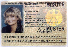
Der deutsche Personalausweis besitzt bekanntlich eine Seriennummer, die auf der Vorderseite unten aufgedruckt ist (zweite Zeile).

Bild eines Personalausweises

Bildquelle: Bundesdruckerei GmbH

Ich habe nun schon öfters ein Gerücht gehört, dem zufolge die letzte Zahl der Seriennummer (nach den letzten sieben eckigen Klammern) angeben würde, wie viele andere Bürger mit dem gleichen Vor- und Nachnamen es in Deutschland oder gar dem Bundesland des Ausweisträgers geben würde.

Das Gerücht ist natürlich Humbug. Die Wahrheit ist viel nüchterner: Bei der letzten Zahl handelt es sich um die sogenannte Gesamtprüfsumme, die — zusammen mit den restlichen Prüfsummen der Seriennummer — eine Validierung der Seriennummer ermöglicht.

Natürlich handelt es sich hier um einen schwachen Fälschungsschutz, da der Algorithmus zur Berechnung der einzelnen Prüfsummen öffentlich bekannt ist; entsprechend gibt es im weiten Internet auch Generatoren, die vollkommen gültige, aber nicht existierende Seriennummern generieren.

Wenn man es ganz genau nehmen möchte, bezeichnet man die zweite Zeile im unteren Teil des Personalausweises auch nicht als Seriennummer (hierbei handelt es sich eigentlich nur um die Zeichen vor den ersten spitzen Klammern), sondern als zweite Zeile der maschinenlesbaren Zone (MRZ).

Mehr Informationen zur Berechnung der Prüfsummen gibt es bei pruefziffernberechnung.de und der Wikipedia.